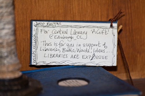
This post was going to be a broad survey of some information about altered book art, some links to etsy shops, some artwork by revered artists and some resources for further reading but maybe I'll write that other post later, because my plans have been derailed by a mystery.
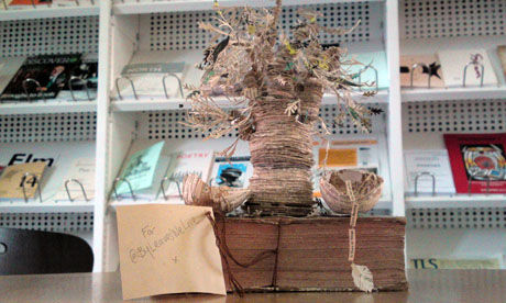
The Scottish Poetry Library has recently received an anonymous gift. A paper sculture of a tree, made all out of books. The Guardian is charmed but doesn't know what to think
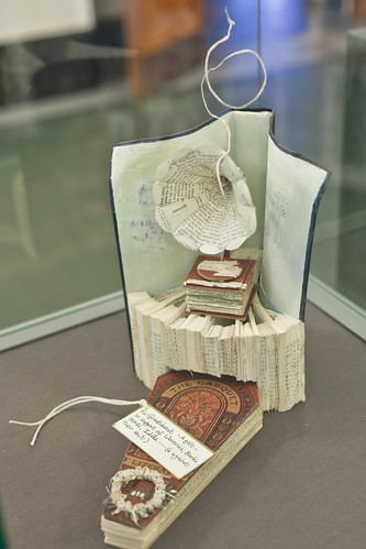
Grand Central details the story as more sculptures appear, in an outpouring of love for books and for libraries.
These sculptures seem to be coming from one, exuberant lover of books and libraries. Although I love much of the progress towards digitized media, (this blog I'm writing is one I could not share without digitized text), I am sorry for the libraries. And what better way to celebrate the love of libraries than with artwork celebrating the paperness of books now.
a work in progress to share ideas and inspirations as we prepare for a feminist fairytale production of Shakespeare's play.
Tuesday, September 13, 2011
Thursday, September 8, 2011
The Ice Book
The Ice Book (HD) from Davy and Kristin McGuire on Vimeo.
While looking into paper sets and pop-up books as sets Linden came upon this short film advertising for a miniature show made of pop-ups and light design. We're not going to turn the lights out on our audience in All's Well, but Davy and Kristen McGuire, the artists behind The Ice Book use the lights masterfully. For more information about their show read the information packet about their show, or go to their website.
What does a set made of paper contribute to this show? Is it just the delicacy? The portability of little theater? The translucence? Is there something about books coming to life that is itself magical?
Tuesday, September 6, 2011
Playing Paper
This is an essay I wrote for a class in Textual Culture here at Mary Baldwin which explains a great deal about the ideas and intentions behind this project.
My understanding of fairytales comes from storybooks. Hardcover, full-color beautifully designed books that send their messages through pages with decorated capitals and a font chosen to suggest manuscript. Books that evoke a tradition, a past, a notion that even if Paul O. Zelinsky’s Rapunzel was published in 2002, tells its story as though it belongs in a time beyond regular dates, far away and long ago. That message of the fairytale is one which seems to belong in paper, but also in performance, where the symbols which soak each page of a fairytale are easily recognizable onstage. We know the young girl, starry eyed and full of wonder, chasing after her dreams. We know the young prince seeking to find his place in the world, and we see the forces around them, be they magical or political or comical bringing them together or tearing them apart. They are characters which resist electronic transfer. What would the text of Harry Potter be without the the font designed for J. K. Rowling, morphed out of design or layout into the convenience of an ebook? It would still be the same words, but the aura of fantasy would be altered, and not merely altered but reduced.
When performing a play cast with fairytale characters, it seems most natural to return to books and to paper as the operating medium for the symbols those characters so richly possess. For All's Well that Ends Well, the cinderella story with the prince-not-so-charming, Linden Kueck is working ideas of fairytale to comment on ways in which stories are passed down from generation to generation, and how human beings, but particularly women color their actions to conform to the cultural stories they believe they should be a part of. To facilitate this goal, I will be working as her designer to build a set, props, and even some costume pieces out of paper. All the paper will be white, and at least in this point in the process we are imagining the paper clean and unwritten on, the blankness of a common metaphor for women, as the object on which men inscribe. The white paper also serves as a symbol which will work to emphasize the texture of the paper, and with no color to distract, except for any symbols of power (the crown, the ring) set off in a startling red.
You might wonder, if the set is to be a book made of blank paper, where is the artistry of design so looked for in a fairytale? Since first coming in contact with electronic books, I have been exploring the ways in which the tactile properties of paper affects the understanding of a story. This often true in picture books where much of the drama of the story lies in the turn of the page as a codex, something which would be lost if viewed on a screen unless the program simulated the turn of the page in some sort of graphic medium. I have already mentioned books published in a specific font which would loose some of their charm if morphed into the regular typeface of an ebook. But of all kinds of books, the type most resistant to digital translation is the pop-up book. I find it vastly amusing to see the “Tell the Publisher! I’d like to read this book on Kindle” link on Amazon for Robert Sabuda’s Movable Mother Goose, because pop-up books or movable books in general glory in the paperness of paper, and explore all of its creative potential. White Noise, a popup book by David A. Carter explores the different sounds that paper makes through a series of abstract pop-up spreads united through a poem. Others use cut shapes to show the figures they portray without any printing onto the shapes. Still others revisit often told tales and make them live by giving them a third dimension. Pop-up books seem especially pertinent at the particular point in history, as we, like the Early Modern culture are in a time of textual transition. Culture in England was moving from manuscript to print, and culture today is moving from print to digital, our times are mirrored in a way, and that mirroring deserves some comment, comment made by books which revel in their paperness.
But what can all this fascination with paper and stories lend to a rehearsal room? Would it merely give us a heightened awareness of the lines pertaining to paper and print? To the paper props? The letters? (Are they blank? If not, what’s written on them?) How does an historical awareness affect a production? Will the pop-up book set feature castles --slightly postmodern in their architecture? What if the posters were cut paper? Pop-up programs? What would that say about the production? Simply that paper is important? That it should be noticed and valued for the story it tells in itself, not only what is imprinted on it?
In this way, the paper itself can be a metaphor revisited. If early modern writers objectified women by using images of books and paper which are meaningless without a male hand composing their significance, playing with paper dismantles that binary. Paper can convey meaning through its own folds, a meaning without words but expressively augmenting the actions and words of the actors on the stage, presenting their stories with a backdrop of tradition and fantasy. Whose tradition and whose fantasy is up to the audience to unfold.
Intro post
So who am I and what am I doing this project for?
My name is Clara Giebel and I am designing for a production of William Shakespeare's All's Well that Ends Well as directed by Linden Kueck. This project is in partial fulfillment of our Master of Fine Arts degree in Shakespeare and Performance. Looking particularly at what in this play is like a fairy tale I am working to give this production a distinctly tactile, papery visual aura, one which draws the audience's attention to the characters and also to our place in the history of books and paper industries.
Why All's Well?
All's Well that Ends Well provokes questions with its very title. As a story of a woman in love with a man who cares nothing for her, and ultimately coerces him into joining her an accepting marriage, the audience is often left wondering if all has ended well. The two young people are together at the end, but is that good for either of them? In a "talkback" with the actors after a recent production at the American Shakespeare Center, the actors playing this couple were asked point-blank if they thought it would work out, and the actors didn't have a straight answer. Helena's all in, but is that enough? These aren't questions that have clear answers, which opens up many doors to a variety and richness of interpretation.
Why this blog?
Linden and I will be using this blog to post information we are thinking about, images and media which play into our explorations of this play and the concepts we are playing with. There will be some scholarly writing, lots of pictures, photographs of the set, props and costumes in progress, and a lot of opportunity for discussion.
Image from Jackie Huang.
Subscribe to:
Posts (Atom)