Showing posts with label paper. Show all posts

Saturday, April 14, 2012

On Publicity Photos and Plowing Ahead


At this point, we are quite in the thick of things. Clara is making paper hats and paper swords and pop-ups and paper paper paper. I am sewing endlessly, running rehearsals, and working to make sure everything comes together. It is a busy time three weeks before opening.


This morning, Amanda--our Helena--and I had a photo shoot so we would have a few shots to send out with publicity. So we traipsed about Staunton with pop-up books and paper stars. I thought I would share some of my favorites with you as a teaser for what's to come.


Monday, March 12, 2012

Some pop-up videos!

There are some wonderful resources on pop-up books available freely on YouTube. Here is a seven minute video by the Smithsonian Libraries in collaboration with their exhibit on movable books. It details the process of making a pop-up book. 


Here is a 53 minute lecture by David Carter which he gave at the Smithsonian Libraries, talking about his work in book making. Tidbits include his work on a giant book for an exhibit, his work teaching children about pop-ups, and a lovely question and answer session in which he talked about a pop-up ap for iphone.


And finally, if you'd like to get started yourself, a one and a half minute video on how to make a particularly stunning pop-up card.


Enjoy!

Monday, March 5, 2012

Tell me, who is Helena?


The paper has arrived! Clara and I have been fortunate enough to receive of gift of good, sturdy fine art paper from which to build our pop-up book. Clara's father, who is an art professor, insisted that a project this artful should, indeed, be a work of art and therefore must be crafted out of quality materials--so he sent us a generous gift of beautiful, strong bristol board among other papers.

Serendipitously enough, the box the paper came in is the perfect size for crafting an overlarge pop-up book and Clara and I are already plotting ways to paint it white and make it the cover of our book. As Clara begins to construct prototypes of the four sets that will form the pop-up book (you will see the pictures scattered throughout this entry), I have begun to think about the ways in which the book and pop-ups and writing will feature in the production of the play itself.

In a meeting at the beginning of the semester, my thesis supervisor, Ralph Cohen, challenged me to make sure that the concept Clara and I had created for the design of the production was a part of the directing of the production as well. This was something I had already been considering--in the early stages of this process, Clara and I tossed around
various ideas: having characters quite literally be on book, reading their lines, characters performing the act of writing in significant moments in the play, and even--in a wild moment--burning the entire paper set as a statement about the ephemerality of theater (something we have reconsidered in the face of our tremendous hours of work and the quality of some of our materials).

As we have settled into our ideas somewhat, it has become the connection between gender identities and paper and writing that most interests me and will be at the center of what I do as the director of this production. We have been thinking of pop-ups as feminine--paper telling its own story--and written text as masculine--the phallic pen put to passive paper. And what originally drew me to this play was the way in which Helena both does
and does not write her own story. She has more soliloquies than most of Shakespeare's heroines--she is certainly trying to tell her own story in a way so few female characters get to. But at the same time, once she has married Bertram, she must play by his rules--she must fulfill the story he creates when he writes the letter.

So what we will be playing with as we begin rehearsals in a month, is this very idea. Who opens and closes the pop-up book? Who turns the pages? Who, in other words, is responsible for the development of the story? I have begun to think more and more about which characters might interact with the book--Helena, Bertram, the King--and how and when they might do so. I have also decided that Helena will, indeed, be literally on book for parts of the play. She will be reading her lines from a text that has been given to her, delivered in or with Bertram's letter. Part of what we will explore in rehearsal is when Helena is on book and when she is creating her own story.

One of the effects of this choice is that--as Ralph Cohen put it--the actress playing Helena, in this case, the lovely Amanda Noel Allen, must perform the act of reading. This offers a lot of potential--when is Helena surprised? Delighted? Disgusted? When does she laugh at what she says? When does she resist saying it? And, more intriguingly, who, then, is Helena? If she is not the words Shakespeare (and his editors) have given her, who is she? Is she Amanda herself? Me? Some sublime combination of the two of us? Or the three of us? Whose story do we end up telling? As we consider these questions, I leave you with an Oscar-winning animated short. It has a lot to say about the act of reading.


The Fantastic Flying Books of Mr. Morris Lessmore (2011)

Thursday, February 16, 2012

Pop-up Books and their Engineers


In a time when e-readers are becoming more popular, pop-up books and the field of paper engineering mark an important contrast to an increasingly digitized world. In a pop-up book, paper is not the passive canvas on which the text provides meaning, paper is a sculpture, a dancer, a story in itself. I'll be posting several posts on pop-up books, but this first one is mainly to educate about some of the important paper engineers working in the field today. If you click on these artist's names the link will take you to their websites all of which include "how-to" sections, to make your own pop-ups at home.


Robert Sabuda is the world's most popular pop-up artist. Besides some beautiful original works such as Christmas Alphabet or Winter's Tale, he has created pop-up re-tellings of familiar tales such as Alice in Wonderland (left) or Beauty and the Beast or the lyrics to America the Beautiful (above). He often works primarily in white or solid colored paper, which really shows off the stunning artistry of his work.


David A. Carter is a paper engineer and illustrator who has done some really lovely abstract pop-up art for readers of all ages. His more recent books feature bold colors, in dramatic, innovative designs showing off a beautiful intricacy of design as well as some spreads of absolute simplicity. White Noise is book partially about the sounds paper makes as it flutters, or folds, or flaps, or saws. The spreads are united by a free-verse poem which dallies with the sensual beauties of paper. Pictured right is 600 Black Spots, a beautiful book containing exactly 600 spots for those interested to count them all. It's reviewed with more charming pictures of this girl here: http://intheknowmom.net/?p=6856 


Matthew Reinhart works a great deal with Robert Sabuda collaborating on some of the Candelwick pop-up encyclopedia books, such as Encyclopedia Mythologica: Gods and Heroes. He has also illustrated some classics such as The Jungle Book (left). His Pop-up Book of Nightmares, and Pop-up Book of Phobias lend a darker side to the realm of pop-up books for adults. 

Bruce Foster is another name which means a great deal in pop-up circles. He does some beautiful work on pop-ups in a large variety of projects. Perhaps most famous for Harry Potter: A Pop-up book based on the Film Phenomenon, he has also worked on an incredibly beautiful work on Angels, which is soon to be released, and a book holding paper models of some of the greatest architectural wonders of the world. 
 
 I'll post some more about pop-ups soon!

Thursday, February 9, 2012

Thesis Festival


This past week we the MLitt/MFA program held our thesis festival, a marathon of scholarship where every MLitt student and every MFA dramaturgy emphasis presents his or her thesis in a combination of scholarship and stagecraft. Though I will be posting some more about many of the ideas in this thesis, I thought I would share Cass Morris' excellent summaries of all of the presentations so that you can read about my most presentation as well as the other exciting work going on in this program.

http://americanshakespearecentereducation.blogspot.com/2012/02/2012-mlittmfa-thesis-festival-session-2.html

Picture by Ralph Alan Cohen, for more pictures of the festival go to the program Flickr account: 

http://www.flickr.com/photos/mbc_sap/

Tuesday, January 24, 2012

Image sharing and idea sparks

Our semester is already in the swing of things; our colleagues’ productions are coming together, the Mary Baldwin Mlitt/MFA Thesis festival is fast approaching and Linden and I are working hard on designing for All’s Well, and really enjoying meeting with Jenny McNee every week. Some of the work we’ve been putting into this show is looking to find the best means of communicating our research, and we’ve decided to expand outside of this blog. We now have a Flickr account to share pictures of the things we are making as we make them, as well as many images of our sketches and plans for characters and costumers.

You can find our Flickr account here: http://www.flickr.com/photos/allswellindesign/ 
 
Additionally, Linden and I have dived into Pinterest, an online bulletin board or images, videos and project ideas. Not only has it been delightful to pin photographs and artwork which inspires our thoughts for this project it has also put un into contact with other pinners and their ideas and creations. For instance, one can make ordinary plastic toys look like ceramics with only the help of a can of glossy spray paint click here for details of that project: http://dreamgreendiy.com/2011/08/15/pinspiration-monday-white-horse/

You can find our Pinterest account here: http://pinterest.com/agenttam99/alls-well/ though you will need to sign up for Pinterest if you want to see it.

What is all this sharing and exploring doing for our process? It means not only that we’re getting lots of people to see at least pieces of our work, but that we can shape our ideas by the images we find. Some of our images are not based out of the words the characters say, (Helena will have stars because she is always talking about them) but the characters from other sorts of fantasy stories or fairy tales which the characters remind us of. LaFeu doesn’t share any lines with the White Rabbit from Alice in Wonderland, but those characters remind us of each other, so we’ll give Lafeu a pocketwatch, and maybe have some clockwork decorations on his jacket and his hat. The healing of the King in this play may also draw some inspiration from the Lord of the Rings and the Two Towers’ movie’s portrayal of Theoden returning to health and the costume choices for the king before and after Helena heals him. These images will morph in our ideas for the play as we keep studying its roots and other productions, but finding inspiration in this forum, (and now these others) is an adventure for us both.

Tuesday, January 3, 2012

Matthew Sporzynski and Paper Sculpture

While recently flipping through a REAL SIMPLE magazine to cut it up for collages, I came across the work of Matthew Sporzynski, a paper sculptor who creates commissioned work for the magazine. His work is intricate and beautiful, often only using one color for the construction, creating a strong emphasis on line, volume and the texture of the paper he uses. What strikes me as interesting about his work is its connection with a magazine titled REAL SIMPLE. The magazine, and its accompanying website boasts "life made easier every day" and is full of simple solutions or creative ideas for many aspects of life, primarily geared towards women. Main topics include Food and Recipes, Home and Organizing, Beauty and Fashion, Holidays and Entertaining, Health, and a section on balancing Work and Life. All of these categories are full of ways of making one's existence more streamlined, efficient and beautiful, while keeping complications and mess to a minimum. Sporzynski's paper seems to fit in this mix, but fits strangely.
In one way, these paper creations are the essence of simplicity. Simple colors. Simple objects presented. Simple materials. These colors, objects and materials are also utilized both skillfully and beautifully, highlighting another main goal of the magazine, and bringing artistry into the cover pages of the different sections of the magazine, and embodying some of the essential values of the publication as it does so.
At the same time, these pieces seem an odd choice. The magazine, despite its appreciation of beauty and purity of construction also values a careful use of time and effort, and gives its readers some clear insights into how to limit complications in their lives. Commissioning art which portrays simple scenes and objects but does so in a which so utterly complicated manner seems odd. In their small paragraph on the REAL SIMPLE website, they introduce his work with the quip, "we don't know how he does it either." There's no sort of suggestions on how to get started doing paper construction yourself, or "how to" section like everywhere else in the magazine. These objects are purely something to look at and be impressed by. Is this as strange as I think it is? Or is it just fueling our culture's stubborn love of paper in an increasingly digital world?

Friday, November 11, 2011

Blank Paper and Luxurious Textiles

Susan Frye’s excellent work, Pens and Needles: Women’s Textualities in Early Modern England examines the many ways in which early modern women’s work in text and textiles re-defined femininity. In this passage she examines the ways in which Giacomo and Innogen speak of different material objects to symbolize Innogen and her body in Cymbeline.

“Innogen’s own language picks up on the extent to which textiles have become metonymic of her body when Pisanio shows her the letter in which Posthumus orders her murdered for her infidelity. But Innogen envisions herself as a completely worked garment rather than the blank sheet of chastity on which a man might write. Before she begs Pisanio to carry out her husband’s order, she castigates herself for having lost Posthumus’s faith in her, calling herself  “a garment out of fashion,” which, too “rich” to be translated into a wall hanging, must be reduced to rags: “And, for I am richer than to hang by th’ walls,/ I must be ripp’d:--to pieces with me!” (3.4.50-53). As a garment too elaborately made--too complete in its own identity to be cut up and translated into a wall hanging--Innogen must be ritually destroyed, ripped to pieces. To Giacomo, she may be the blank white of the sheet, but Innogen sees herself in terms of luxurious, colorful textiles, even as she imagines herself as that rich cloth ripped to pieces” (186).

In this project we’re looking at ways of re-defining the “blank page” of femininity, and it is exciting to see that redefinition happening as the texts are being written. What other characters use textiles as metaphors for themselves? Or for other characters? And what does it say about them?

Tuesday, September 13, 2011

Mysteries in Scotland

This post was going to be a broad survey of some information about altered book art, some links to etsy shops, some artwork by revered artists and some resources for further reading but maybe I'll write that other post later, because my plans have been derailed by a mystery.


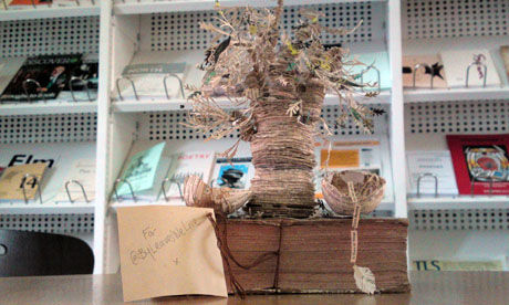
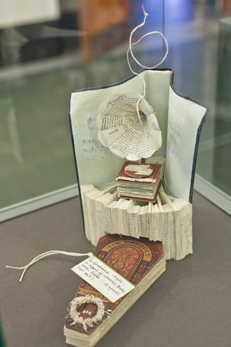
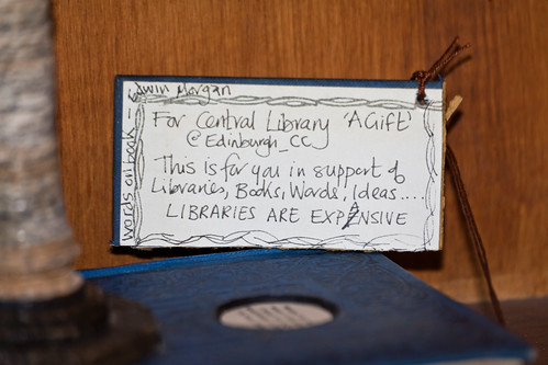
The Scottish Poetry Library has recently received an anonymous gift. A paper sculture of a tree, made all out of books. The Guardian is charmed but doesn't know what to think

Grand Central details the story as more sculptures appear, in an outpouring of love for books and for libraries.

These sculptures seem to be coming from one, exuberant lover of books and libraries. Although I love much of the progress towards digitized media, (this blog I'm writing is one I could not share without digitized text), I am sorry for the libraries. And what better way to celebrate the love of libraries than with artwork celebrating the paperness of books now.

Thursday, September 8, 2011

The Ice Book

The Ice Book (HD) from Davy and Kristin McGuire on Vimeo.


While looking into paper sets and pop-up books as sets Linden came upon this short film advertising for a miniature show made of pop-ups and light design. We're not going to turn the lights out on our audience in All's Well, but Davy and Kristen McGuire, the artists behind The Ice Book use the lights masterfully. For more information about their show read the information packet about their show, or go to their website.

What does a set made of paper contribute to this show? Is it just the delicacy? The portability of little theater? The translucence? Is there something about books coming to life that is itself magical?

Tuesday, September 6, 2011

Playing Paper

This is an essay I wrote for a class in Textual Culture here at Mary Baldwin which explains a great deal about the ideas and intentions behind this project.

My understanding of fairytales comes from storybooks. Hardcover, full-color beautifully designed books that send their messages through pages with decorated capitals and a font chosen to suggest manuscript. Books that evoke a tradition, a past, a notion that even if Paul O. Zelinsky’s Rapunzel was published in 2002, tells its story as though it belongs in a time beyond regular dates, far away and long ago. That message of the fairytale is one which seems to belong in paper, but also in performance, where the symbols which soak each page of a fairytale are easily recognizable onstage. We know the young girl, starry eyed and full of wonder, chasing after her dreams. We know the young prince seeking to find his place in the world, and we see the forces around them, be they magical or political or comical bringing them together or tearing them apart. They are characters which resist electronic transfer. What would the text of Harry Potter be without the the font designed for J. K. Rowling, morphed out of design or layout into the convenience of an ebook? It would still be the same words, but the aura of fantasy would be altered, and not merely altered but reduced.

When performing a play cast with fairytale characters, it seems most natural to return to books and to paper as the operating medium for the symbols those characters so richly possess. For All's Well that Ends Well, the cinderella story with the prince-not-so-charming, Linden Kueck is working ideas of fairytale to comment on ways in which stories are passed down from generation to generation, and how human beings, but particularly women color their actions to conform to the cultural stories they believe they should be a part of. To facilitate this goal, I will be working as her designer to build a set, props, and even some costume pieces out of paper. All the paper will be white, and at least in this point in the process we are imagining the paper clean and unwritten on, the blankness of a common metaphor for women, as the object on which men inscribe. The white paper also serves as a symbol which will work to emphasize the texture of the paper, and with no color to distract, except for any symbols of power (the crown, the ring) set off in a startling red.

You might wonder, if the set is to be a book made of blank paper, where is the artistry of design so looked for in a fairytale? Since first coming in contact with electronic books, I have been exploring the ways in which the tactile properties of paper affects the understanding of a story. This often true in picture books where much of the drama of the story lies in the turn of the page as a codex, something which would be lost if viewed on a screen unless the program simulated the turn of the page in some sort of graphic medium. I have already mentioned books published in a specific font which would loose some of their charm if morphed into the regular typeface of an ebook. But of all kinds of books, the type most resistant to digital translation is the pop-up book. I find it vastly amusing to see the “Tell the Publisher! I’d like to read this book on Kindle” link on Amazon for Robert Sabuda’s Movable Mother Goose, because pop-up books or movable books in general glory in the paperness of paper, and explore all of its creative potential. White Noise, a popup book by David A. Carter explores the different sounds that paper makes through a series of abstract pop-up spreads united through a poem. Others use cut shapes to show the figures they portray without any printing onto the shapes. Still others revisit often told tales and make them live by giving them a third dimension. Pop-up books seem especially pertinent at the particular point in history, as we, like the Early Modern culture are in a time of textual transition. Culture in England was moving from manuscript to print, and culture today is moving from print to digital, our times are mirrored in a way, and that mirroring deserves some comment, comment made by books which revel in their paperness.

But what can all this fascination with paper and stories lend to a rehearsal room? Would it merely give us a heightened awareness of the lines pertaining to paper and print? To the paper props? The letters? (Are they blank? If not, what’s written on them?) How does an historical awareness affect a production? Will the pop-up book set feature castles --slightly postmodern in their architecture? What if the posters were cut paper? Pop-up programs? What would that say about the production? Simply that paper is important? That it should be noticed and valued for the story it tells in itself, not only what is imprinted on it?

In this way, the paper itself can be a metaphor revisited. If early modern writers objectified women by using images of books and paper which are meaningless without a male hand composing their significance, playing with paper dismantles that binary. Paper can convey meaning through its own folds, a meaning without words but expressively augmenting the actions and words of the actors on the stage, presenting their stories with a backdrop of tradition and fantasy. Whose tradition and whose fantasy is up to the audience to unfold.

Intro post


So who am I and what am I doing this project for?

My name is Clara Giebel and I am designing for a production of William Shakespeare's All's Well that Ends Well as directed by Linden Kueck. This project is in partial fulfillment of our Master of Fine Arts degree in Shakespeare and Performance. Looking particularly at what in this play is like a fairy tale I am working to give this production a distinctly tactile, papery visual aura, one which draws the audience's attention to the characters and also to our place in the history of books and paper industries.

Why All's Well?

All's Well that Ends Well provokes questions with its very title. As a story of a woman in love with a man who cares nothing for her, and ultimately coerces him into joining her an accepting marriage, the audience is often left wondering if all has ended well. The two young people are together at the end, but is that good for either of them? In a "talkback" with the actors after a recent production at the American Shakespeare Center, the actors playing this couple were asked point-blank if they thought it would work out, and the actors didn't have a straight answer. Helena's all in, but is that enough? These aren't questions that have clear answers, which opens up many doors to a variety and richness of interpretation.

Why this blog?

Linden and I will be using this blog to post information we are thinking about, images and media which play into our explorations of this play and the concepts we are playing with. There will be some scholarly writing, lots of pictures, photographs of the set, props and costumes in progress, and a lot of opportunity for discussion.

Image from Jackie Huang.